Have you ever walked into a room and immediately felt an emotional shift? Perhaps the
soft glow of natural light made you feel calm and focused, or the vibrant yellow walls made
you feel energized and creative. These experiences are not mere coincidences—there’s
a science behind how our surroundings, particularly color, art, and lighting, can
influence our mood, behavior, and productivity. The art and science of interior design are
more than just aesthetics—they can shape our emotions, mental state, and even work performance.
Recently, Nigerian content creator @Hauwa_L asked her followers what “Good colours to
paint a living room”, a flood of responses shows how overwhelmingly a lot of people favor
specific colours. Revealing personal preferences and how deeply our
subconscious emotional connections to colour can influence our choices in living spaces.

This conversation, along with scholarly studies on the emotional effects of color in living
spaces, got us thinking: What role do colour, art, and lighting play in the design of a
space?
How can these elements influence not just our mood but also our productivity?
Colour psychology is the study of how different hues impact human behavior and
emotions. It’s a well-established field, and its influence has been recognized in various
domains, from marketing to healthcare to interior design. According to colour theorists,
colours can evoke both conscious and subconscious responses in individuals, which is
why careful selection of colours is crucial in creating spaces that foster certain moods or
outcomes.
Let’s begin with the basics. Colours can be divided into three primary categories: Warm
colours, Cool colours, and Neutral colours. Each category has its psychological
effects.
1. Warm Colours: These colours, which include Reds, Oranges, and Yellows, tend to
create a sense of warmth, energy, and excitement. They are often associated with passion, creativity, and stimulation. However, too much of these colours can cause feelings of anxiety or restlessness. In spaces where energy and motivation are essential,
such as an office or a gym, warm colours can stimulate focus and creativity. But in spaces
designed for relaxation, such as bedrooms or lounges, these colours might feel
overwhelming.
2. Cool Colours: Colours like Blues, Greens, and Purples are often associated with
calmness, tranquility, and serenity. These hues are commonly used in spaces where
relaxation and focus are prioritized, such as bedrooms, meditation rooms, or workspaces.
Blue, for example, is known for its calming effect, which is why it’s often used in hospitals
or offices to reduce stress and promote productivity. Green, closely tied to nature, also
has a soothing effect and is often used to create a refreshing and peaceful atmosphere.
3. Neutral Colours: Gray, Whites, Beige, and Browns are often considered neutral, as they
don’t evoke strong emotions on their own. However, they can create a balanced and
sophisticated environment when combined with other colours. Neutral tones can
promote focus and stability, which is why they are often used in professional settings or
minimalist designs.
But why does colour affect us so profoundly? The answer lies in both biology and
psychology. Our brains are wired to respond to colour stimuli, which can trigger emotional
and physiological responses. For example, research has shown that red can increase
heart rates and blood pressure, while blue has the opposite effect, lowering both. These
responses are linked to our evolutionary history, where certain colors signaled danger
(red, for instance) while others signaled safety (blue and green, often seen in nature).
The Emotional Impact of Colour
In this study compiled by Arts on the Brain, participants viewed various living rooms in a
3D model, each featuring different wallpaper colours: Red, Green, Blue, and Gray. The
participants were then asked to rate their emotional reactions to these colours, based on
a set of emotions such as happiness, sadness, fear, and disgust.
The study highlights how the psychological effects of colours in living spaces can influence
emotional responses.
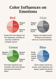
1. Red evoked the most disgust 35%), followed by happiness, neutrality, and surprise. Its stimulating nature makes it ideal for energetic spaces, but less suitable for relaxation.
2. Gray triggered the highest levels of disgust 36.7%) and sadness 23.3%), reinforcing its association with sophistication but also melancholy. It works well as a neutral backdrop but may dampen the mood in social spaces.
3. Green promoted happiness 33.3%) and neutrality 36.7%), though some participants felt disgust 20%). Its natural, calming effect makes it ideal for bedrooms and therapy rooms.
4. Blue elicited the most neutral responses 41.7%), with some happiness and disgust13.3% each). Its stability and calming influence make it perfect for offices and study spaces.
Overall, the study highlights how colour choices can shape emotions and should be
considered carefully in interior design.
The Role of Art and Lighting in Shaping Emotions
While colour is a powerful tool in interior design, it doesn’t work in isolation. Art and
lighting play crucial roles in shaping the emotional environment of a space. Together,
these elements can create a cohesive atmosphere that enhances the intended mood of a
room.
Art has the unique ability to evoke deep emotional responses, often reflecting or
amplifying the mood set by the colour palette. Abstract art, vibrant paintings, or
nature-themed artwork can complement and enhance the effects of colour. For example,
in a room painted in soothing blue tones, an artwork featuring calming nature scenes can
deepen the feeling of tranquility. Similarly, bold, energetic artwork can work well in spaces
where excitement or creativity is encouraged.
Lighting, too, is a significant factor in how colour and art are perceived. The type of
lighting used—whether it’s natural, warm, or cool—can alter the mood of a room. Natural
light is the most effective at boosting mood and increasing productivity. Exposure to
sunlight is linked to higher levels of serotonin, the hormone responsible for happiness and
well-being. Cool lighting, such as bright white or blue-toned lights, can enhance focus
and alertness, making it ideal for workspaces or study areas. On the other hand, warm
lighting, such as yellow or amber tones, can create a cozy, intimate atmosphere, perfect
for living rooms or bedrooms.
Creating Spaces That Enhance Mood and Productivity
The principles of colour psychology, art, and lighting can be applied to design spaces that
positively impact mood and productivity. Whether you are designing a home, office, or
retail environment, consider the following strategies:
1. Identify the Purpose of the Space: Determine whether the space will be used for
relaxation, work, or socializing. This will help you choose appropriate colors and lighting to
achieve the desired mood.
2. Use Colour Strategically: Choose colours that align with the function of the room. For
example, cool tones like blue and green are ideal for workspaces or bedrooms, while
warmer tones like red and yellow are better suited for social or creative spaces.
3. Balance Art and Lighting: Select artwork that complements the colour scheme and
enhances the mood of the room. Use lighting to highlight key elements and create the
right atmosphere—whether it’s natural light, warm light, or cool light.
4. Consider Psychological and Cultural Associations: Keep in mind that colour
preferences and emotional responses can vary based on individual experiences and
cultural backgrounds. What may be calming for one person may not be the same for
another, so it’s important to consider the occupants’ needs and preferences when
designing a space.
Understanding the science behind how colours, art, and lighting impact our mood, you
can create spaces that enhance well-being and foster productivity. Whether you’re
looking to boost creativity, promote relaxation, or encourage focus, interior design has
the power to shape your experiences and improve the quality of life.
To learn more, visit PropertyPro website to get started!